
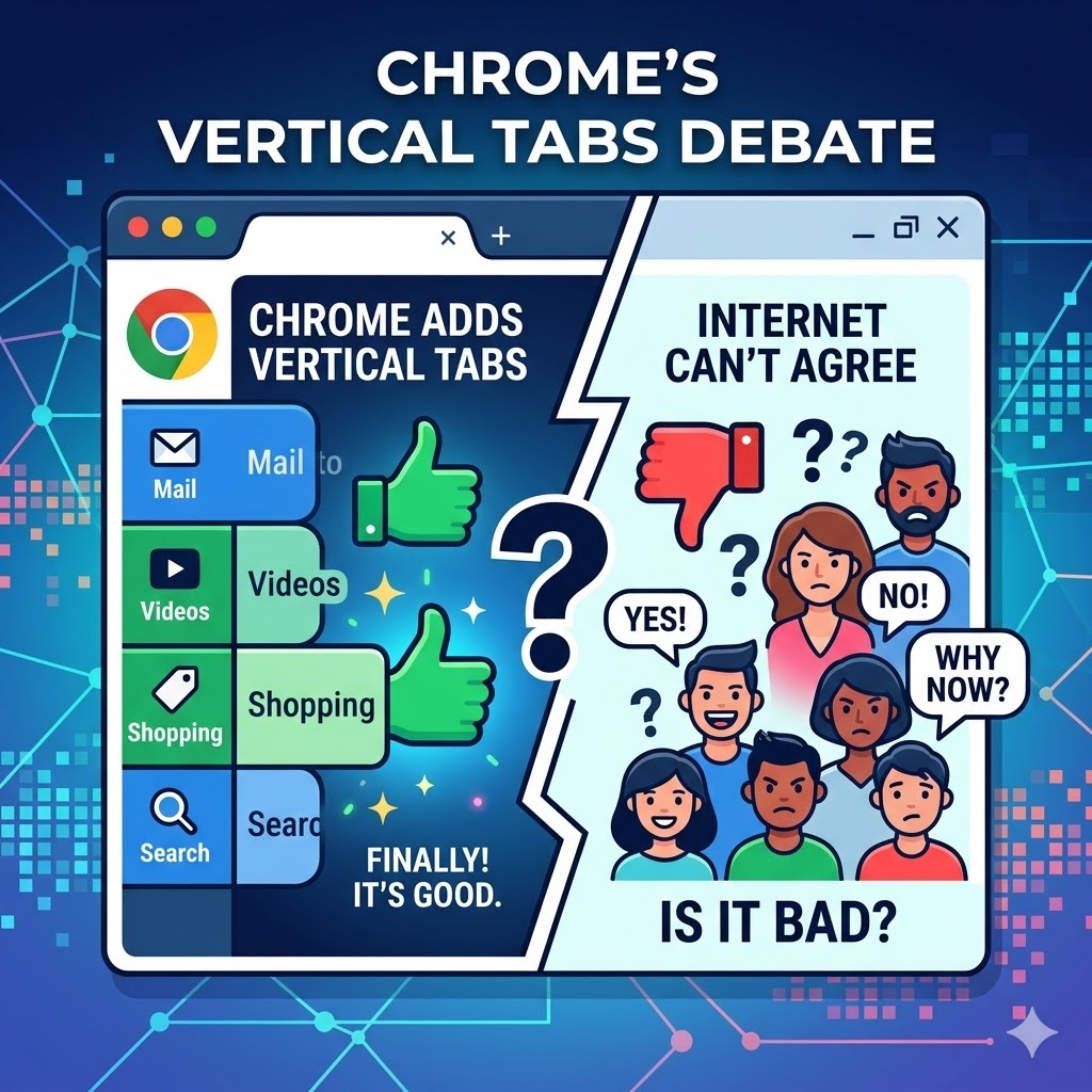
Google Chrome’s vertical tabs feature rolled out on April 7, 2026, ending a debate that has existed inside browser design circles since Chrome’s original launch in 2008. Chrome product managers Alex Tsu and Jess Carpenter announced 2 new productivity features arriving simultaneously: vertical tabs and an upgraded full-page reading mode. Both features are available now via right-click on any Chrome window.
Chrome vertical tabs are 18 years overdue, depending on who you ask. The browser community has a different answer.
What Chrome Actually Shipped
Chrome’s April 7 update delivers 2 specific productivity upgrades to the world’s most widely used desktop browser.
Vertical Tabs move the tab bar from its traditional horizontal position across the top of the browser window to a collapsible sidebar along the left edge. Activating the feature requires 1 action: right-click any Chrome window and select “Show Tabs Vertically.” The sidebar displays full page titles alongside each tab, a direct improvement over the truncated tab labels that horizontal Chrome tabs produce once a user opens more than 8–10 tabs simultaneously. Tab groups remain fully manageable inside the vertical layout. Users preferring a minimal interface can collapse the sidebar to show only website favicons, recovering nearly all of Chrome’s traditional screen real estate.
Reading Mode receives a full-page interface upgrade, stripping visual distractions from any webpage and converting it into a focused, text-centered reading experience. Activation requires right-clicking any page and selecting “Open in Reading Mode.”
How to Turn On Vertical Tabs in Chrome Right Now
Vertical tabs activation in Chrome requires no settings menu, no extensions, and no technical knowledge. The following 5 steps cover everything from enabling the feature to customizing it for your workflow.
Step 1. Open Google Chrome: On your desktop or laptop. Vertical tabs are a desktop feature and are not available on Chrome mobile.
Step 2. Right-click anywhere on the tab bar: At the top of your Chrome window. The tab bar is the horizontal strip where your open tabs currently sit.
Step 3. Select “Show Tabs Vertically”: From the menu that appears. Your tabs will immediately move from the top of the browser to a sidebar on the left side of the screen.
Step 4. Browse normally: Every tab you open will now appear as a row in the left sidebar, displaying the full page title next to the website favicon. Opening new tabs, closing tabs, and switching between tabs all work exactly as before.
Step 5. Collapse the sidebar if you want more screen space: Click the small arrow or toggle at the top of the sidebar to shrink it down to favicon-only view. This keeps vertical tabs active while using the minimum possible screen width.
To switch back to horizontal tabs at any time, right-click the sidebar and select “Show Tabs Horizontally.”
Why Chrome Waited 18 Years for Vertical Tabs
Chrome’s original tab design was a deliberate architectural decision, not an oversight. Glen Murphy, Chrome’s original designer, explained in a 2025 interview that the team intentionally placed tabs at the top to make each tab feel like a standalone application, “the equivalent of a window’s titlebar.” That logic held Chrome’s tab bar in place for 18 years while competitors shipped vertical tab implementations and users built entire browser-switching decisions around the feature gap.
Microsoft Edge shipped vertical tabs in 2021. Firefox’s Zen browser implementation drew consistent praise from power users. Vivaldi offered vertical tabs from its earliest builds. Chrome’s horizontal-only tab bar became the most visible productivity limitation of the world’s most-used browser, holding a design philosophy intact long after user behavior had moved past it.
The vertical tab launch is 1 of 2 simultaneous Chrome redesign efforts. The same Gemini integration that is rebuilding Google Search from the ground up is also reshaping how Chrome surfaces information, making the April 2026 browser update part of a broader interface overhaul rather than an isolated feature addition.
The Screen Space Argument That Actually Matters
The core productivity case for vertical tabs rests on 1 geometric fact about modern monitor hardware. Widescreen monitors, the dominant display format across laptops and desktop setups since 2010, deliver significantly more horizontal space than vertical space. Most websites concentrate content in a centered column, leaving large empty margins on both left and right sides of the page. Horizontal tab bars consume vertical space, which is the scarcer dimension, to display tab labels in the wider dimension, where space is already abundant.
Vertical tabs consume horizontal space, specifically the left margin that most websites leave empty, while returning the full vertical height of the screen to page content. On a standard 16:9 widescreen display, the vertical tab sidebar occupies space that would otherwise display a website’s blank background.
| Tab Layout | Space Consumed | Screen Space Recovered |
| Horizontal tabs (default) | Vertical height, the scarcer dimension | None |
| Vertical tabs (collapsed) | Narrow favicon strip in left margin | Full vertical screen height |
| Vertical tabs (expanded) | Left sidebar in a typically empty margin | Full vertical screen height + readable tab titles |
What the Browser Community Actually Thinks
Chrome’s vertical tab launch generated immediate and divided community response across Reddit’s r/browsers thread, producing 3 distinct user positions that reflect genuine workflow differences rather than preference disagreements.
The multitasking case for vertical tabs centers on tab volume. Users managing 15–30 open tabs simultaneously find horizontal tab bars functionally unusable, individual tab labels compress to illegible widths, and locating a specific tab requires scanning a row of indistinguishable favicons. Vertical tabs display full page titles at every tab count, eliminating the tab identification problem at scale.
The minimal tab usage case against vertical tabs reflects a different workflow reality. Users maintaining fewer than 10 tabs simultaneously, a common discipline among focused workers, receive no practical benefit from vertical tabs. The sidebar occupies screen space without solving a problem that does not exist in their workflow.
The muscle memory resistance case captures the honest friction of layout switching. Browser tab position is one of the most deeply ingrained UI habits in daily computing. Users who have navigated horizontal tabs across 10–15 years of daily browser use report genuine disorientation when switching to vertical layouts. Not because vertical tabs are worse, but because the motor memory for horizontal scanning is stronger than any geometric argument about screen space efficiency.
The muscle memory friction vertical tabs create mirrors the same behavioral resistance that greets every foundational UI change in daily computing. Windows 11’s haptic feedback redesign encountered identical pushback from users whose physical interaction habits had been built around a decade of prior interface conventions.
Our Take: Right Feature, Right Time, Still a Preference
Chrome’s vertical tab implementation is technically sound and genuinely useful for a specific user profile: multitaskers managing high tab volumes on widescreen displays who spend extended sessions inside a browser window. For that profile, the feature delivers a measurable productivity improvement by eliminating the tab identification problem at scale and recovering vertical screen height that horizontal tabs were consuming.
The Reddit community’s pushback is also correct, for a different user profile. Vertical tabs solve a problem that minimal-tab users do not have. Forcing a layout change on users whose horizontal tab workflow functions cleanly produces friction without benefit.
Chrome’s correct decision was to make vertical tabs opt-in, not default. The feature belongs in Chrome. Whether it belongs in your Chrome depends entirely on how many tabs you actually keep open and how much that number costs you in daily navigation time.
Chrome’s productivity feature expansion is happening in parallel with a separate Google project targeting the browser’s AI layer. Google’s Edge Eloquent initiative reflects the same competitive pressure that vertical tabs address on the interface side, with Google building AI-native browsing capabilities directly into Chrome to close the gap with Microsoft Edge’s Copilot integration.
Browser updates, productivity tools, and the software changes reshaping how people work are covered every week at The IT Horizon. Subscribe to our newsletter. We track every platform update worth knowing about so you can decide what’s actually worth your time.